


I have been learning HTML & CSS for a few days and decided to make something from it. Here's a step-by-step guide of how to make a MINION! It's a fairly simple design, nothing too complex. (Scroll to the bottom to see the final result)
PS: I'm just a beginner (literally been only 2 days since I started CSS :P), so my code may not be perfect. If you come across errors/ improvements/ suggestions, do let me know in the comments below.
Let's begin!
Step 1:
Get all the parts in order.
For a minion we first need an Upper Body which contains the eye and mouth, the goggles, the arms, and the dungaree (let's just call it a dress, for simplicity).
Then we construct the lower body with the lower half of the dress, legs and shoes. The HTML code below shows all the parts accordingly.
<body>
  <div class="minion">
    <div class="upper-body">
      <div class="eye">
        <div class="eye-ball"></div>
      </div>
      <div class="eye-band"></div>
      <div class="mouth"></div>
      <div class="left-arm">
        <div class="left-palm"></div>
      </div>
      <div class="right-arm">
        <div class="right-palm"></div>
      </div>
      <div class="left-strap"></div>
      <div class="right-strap"></div>
      <div class="dress"></div>
    </div>
    <div class="lower-body">
      <div class="left-leg">
        <div class="left-shoe"></div>
      </div>
      <div class="right-leg">
        <div class="right-shoe"></div>
      </div>
    </div>
  </div>
</body>
You'll see how all the parts have been segregated into right and left, including the straps of the dress.
Step 2:
Next we style using CSS.
The way I did it was to create all the parts first and position them properly later. I have pasted the CSS code with the positioning. You might have to change some measurements accordingly. First is the upper and lower body.
.minion {
    position: absolute;
}

.upper-body {
  width: 80px;
  height: 100px;
  border-radius: 40px 40px 0 0;
  background-color: yellow;
  position: absolute;
  left: 100px;
  top: 100px
}

.lower-body {
  width:80px;
  height:25px;
  background-color:#576ad4;
  border-radius: 0 0 10px 10px;
  position: relative;
  left:100px;
  top: 200px
}
Then the dress, which is attached to the lower body.
.dress {
  width: 40px;
  height:25px;
  background-color: #576ad4;
  position: relative;
  left: 20px;
  bottom: 110px;
}

.left-strap, .right-strap {
  width:5px;
  height: 30px;
  background-color: #576ad4;
}

.left-strap {
  position: relative;
  left: 10px;
  bottom: 70px;
  transform: rotate(-60deg)
}

.right-strap {
  position: relative;
  left: 65px;
  bottom: 100px;
  transform: rotate(60deg)
}
Then we work on facial features - eye, goggles and mouth. So there are 4 components essentially, including the eyeball.
.eye-band {
  width:80px;
  height: 8px;
  background-color: black;
}

.eye {
  width: 35px;
  height: 35px;
  background-color: white;
  border-radius: 50%;
  border:3px solid black;
  position: relative;
  left: 20px;
  top: 25px;
}

.eye-ball {
  width: 10px;
  height: 12px;
  background-color: black;
  border-radius:50%;
  border: 5px solid brown;
  position: relative;
  left: 7px;
  top: 7px;
}

.mouth {
  width: 15px;
  height: 10px;
  background-color: black;
  position: relative;
  left: 33px;
  top: 20px;
  border-radius: 50%
}
Now, its time for the arms and palms. Left and right have been done separately. They require a certain degree of rotation to fit nicely. Again, it can be changed to make different actions of the hand.
.left-arm, .right-arm {
  width: 7px;
  height: 40px;
  background-color: yellow;
  border-radius: 10px;
}

.left-arm {
  position: relative;
  right: 8px;
  top: 20px;
  transform: rotate(10deg);
}

.right-arm {
  position: relative;
  left: 80px;
  bottom: 20px;
  transform: rotate(-10deg)
}

.left-palm, .right-palm {
  width: 8px;
  height: 12px;
  background-color: #6f717a;
  border-radius: 120px 120px 40px 40px;
}

.left-palm {
  position: relative;
  top: 30px;
  transform: rotate(-10deg);
}

.right-palm {
  position: relative;
  top: 30px;
  transform: rotate(10deg);
}
Finally, we have the legs and shoes. Right and left separately.
.left-leg, .right-leg {
  width: 20px;
  height: 10px;
  background-color: #576ad4;
}

.left-leg {
  position: relative;
  left: 15px;
  top: 25px;
}

.right-leg {
  position: relative;
  left: 45px;
  top: 15px
}

.left-shoe, .right-shoe {
  width: 25px;
  height: 10px;
  background-color:#6f717a;
  border: 1px solid black;
}

.left-shoe {
  position: relative;
  top: 10px;
  right: 5px;
  transform: skewX(-10deg);
  border-radius: 50px 30px 0
}

.right-shoe {
  position: relative;
  top: 10px;
  transform: skewX(10deg);
  border-radius: 30px 50px 30px 0
}
Step 3:
Now we get to the interesting part: Animating the Minion!
I have done a simple animation of the minion waving hello. We add 'animation-name', 'animation-duration' and 'animation-iteration-count' to the left-arm selector, then use the keyframes rule to animate it.
.left-arm {
  position: relative;
  right: 8px;
  top: 20px;
  transform: rotate(10deg);
  animation-name: say-hi;
  animation-duration: 1.5s;
  animation-iteration-count: infinite;
}

@keyframes say-hi {
  0% {
    transform: rotate(120deg);
    transform-origin: top right;
  }

  10% {
    transform: rotate(155deg);
    transform-origin: top right;
  }

  25% {
    transform: rotate(120deg);
    transform-origin: top right;
  }

  50% {
    transform: rotate(150deg);
    transform-origin: top right;
  }

  100% {
    transform: rotate(120deg);
    transform-origin: top right;

  }
}
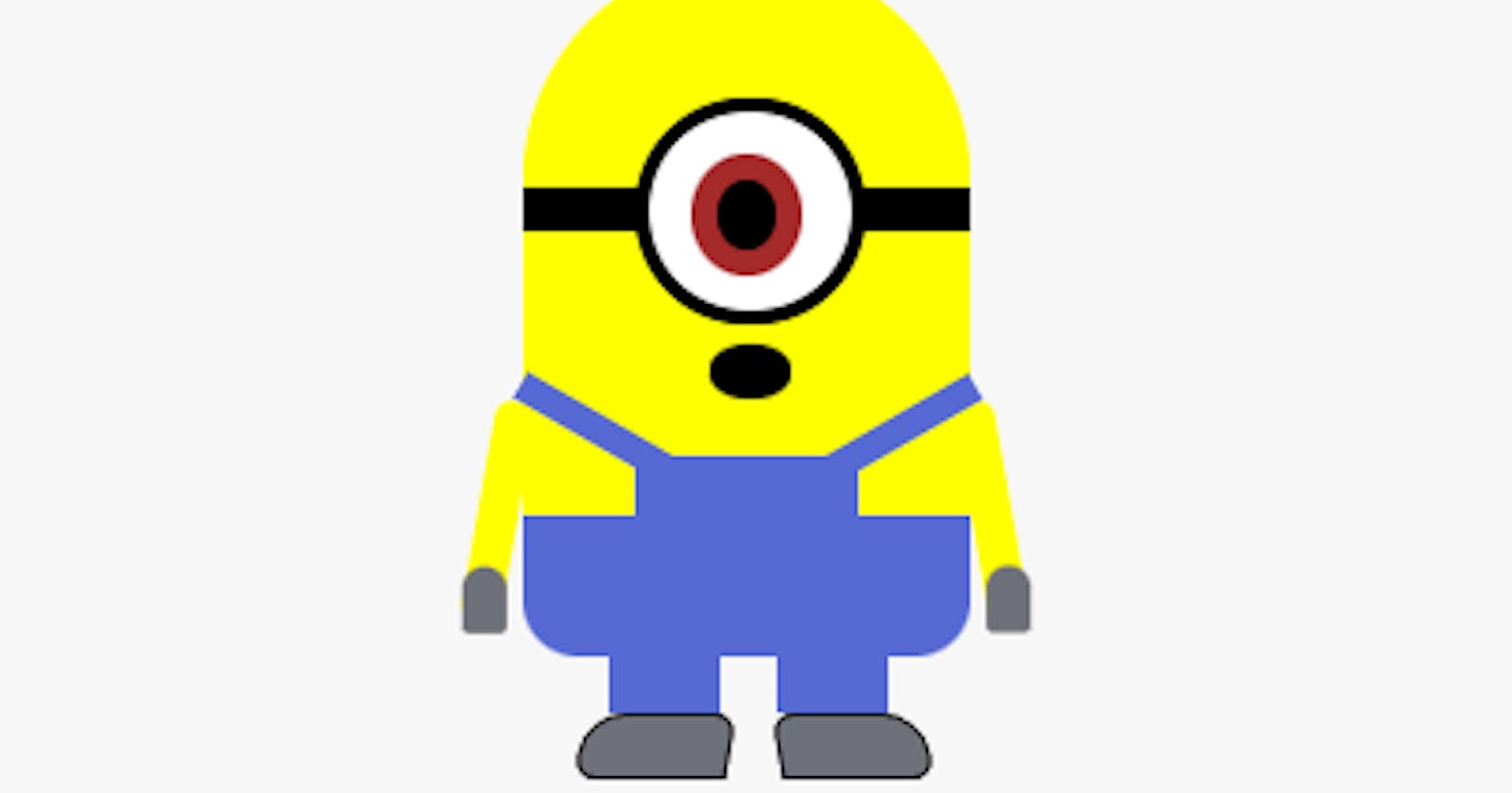
Here's a look at the final result. (Click on 'Result' to see the outcome)
I have tried to make all measurements and colors as close to real as possible. I would like to reiterate that I'm still a beginner. Any suggestions for improvements are welcome.
Thank you for reading! See you in my next blog.